A New Home For Your Music
Product Design Team, Amuse
The Music tab is now bigger, bolder and more beautiful. The new music tab is part of an effort to redesign the whole app over the coming months. In this article, I will try to explain the rationale behind the new design, as well as show some directions that didn't make the cut.
 Our main purpose at Amuse is one thing and one thing only: making it as easy and possible for an unsigned artist to release their music to the whole world. That's why we keep pushing forward. That's why we keep improving. This update is purely visual. It doesn't come with any new functionality but is a big step in terms of clarity and avoiding confusion for our artists.
We know from user interviews that the process of releasing your music comes bundled with a lot of anxiety. You have worked hard on your music –it's your baby– so when it comes to releasing it for the whole world to hear, nothing can go wrong. This is true for both professional artists that we talked to, with millions of streams, as well as DIY artists that only get ten streams per song. Our users are artists, not robots. They are often driven by feelings, not reason.
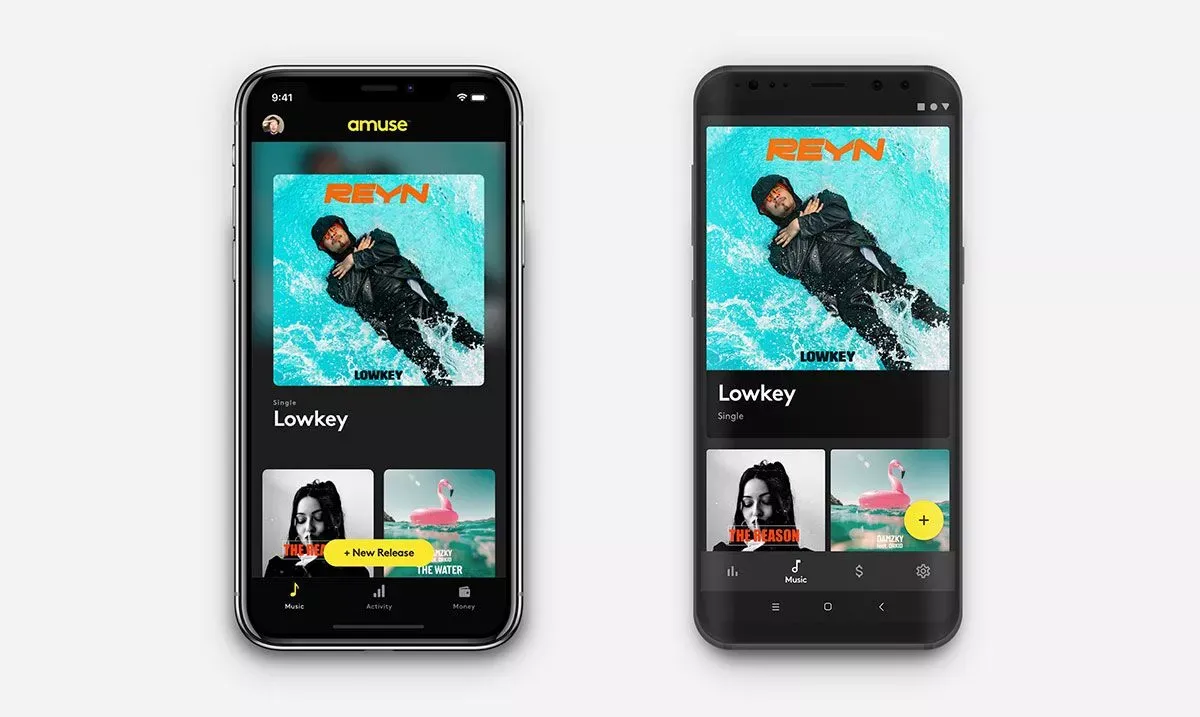
New iPhone design
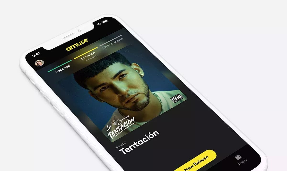
Naturally, you want to know what is happening with your release every step of the way. Our app was making a poor job of that. We knew that from the sheer number of questions to our support team regarding releases awaiting approval. While you could see the current status of your release in the app, it gave you no further explanation on what's coming next and when you can expect that to happen. So we made the status of your release much more clear along with a new push notification alerting you of any progress made.
New Android Design
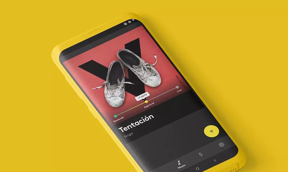
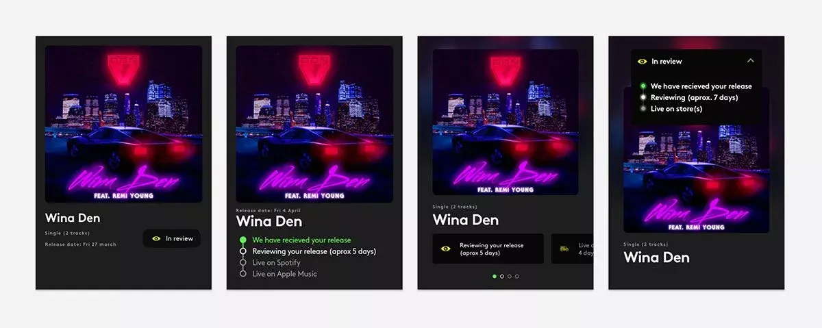
We tried out a number of different versions for the status bar, from the visually attractive to the super clear ones. This was by far the most difficult part of the project. We landed on what we internally call "the Christmas lights". A minimalistic approach that tells you the essentials: what’s happening now, what happened before and what's next. While this design worked well for iPhone it felt too close to the tabs for Android so it looks slightly different there.
Amuse is a pretty young company, we have only been around about a year and a half. Most artists release a new song every 3-4 months on average. That means that most of our users have one or two releases as of now. The previous design was created to handle a lot of different releases with different statuses, but the reality is that almost every artist only cares about their latest release; that release is either in approval or is the sole tracks that are being listened to right now. With this new design, the main focus is on your latest release: it's the first thing you see when you open the app.
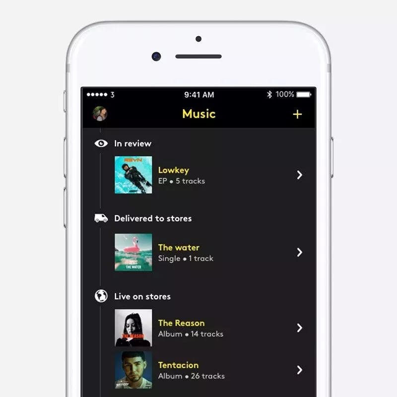
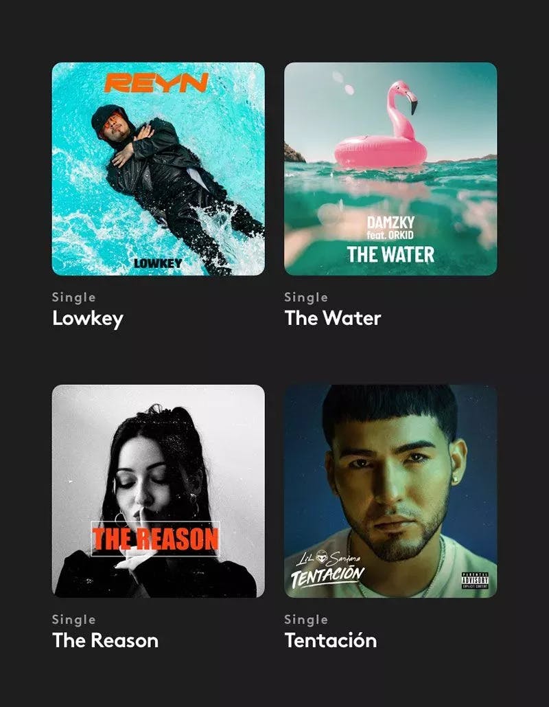
Most of our artists have not only poured their souls into their music but have also put a lot of time and effort into creating visually stunning cover artworks. We have now made the artworks in the app bigger and more prominent so that you can take pride in your creation when browsing your music.
Different directions for the new status bar
Up until now our apps for iPhone and Android have been almost identical. While it's good for brand recognition, it often leads to a compromise: an experience that's either skewed for one platform or equally bad on both. That stops today. From now on, we are building a tailor-made experience to better fit each platform. This is truly exciting for us. For Android, we are staying very true to the new Material Design with big cards and lists. The only thing that is custom built by us is the status update. The iPhone app was heavily inspired by the App Store app. We also added a little blur and pulsating lights to make it pop. Both versions look great in their own way and we are really looking forward to taking each platform further.
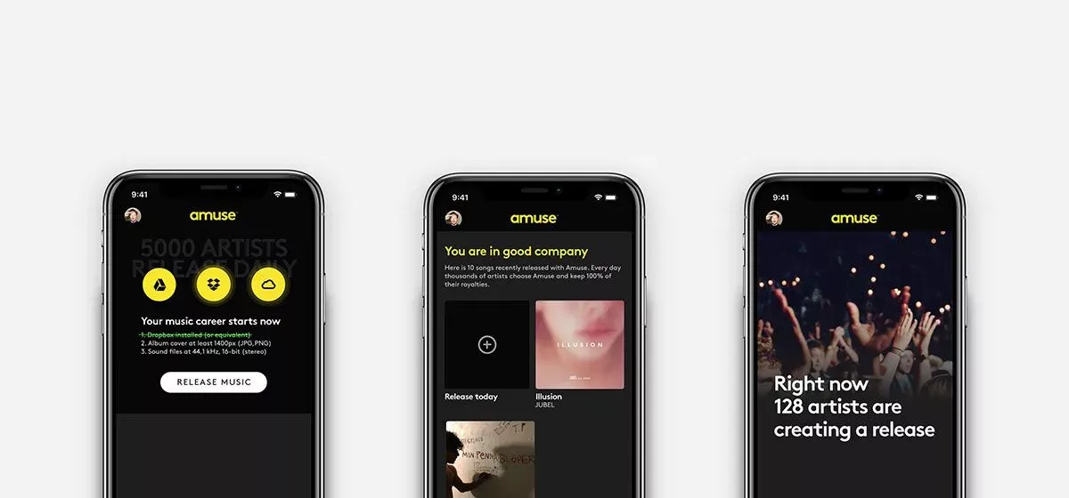
Before the redesign, users with no releases saw a totally empty screen. That wasn't any fun. Instead, we wanted an empty screen that felt alive, that inspired the new users into releasing music and becoming artists. We experimented with a big banner focusing on what assets you needed to prepare. We even had some design that showed other artists’ releases to give users the feeling that they are not alone — they aren't, we have thousands of releases every month. We settled on a video from a concert, shot from a point of view perspective to sell the dream of becoming a big artist.
We are adding more things to the music screen soon! First, we are building shareable links available directly in the app. We are currently testing our link shortener amu.se to see that it works well before we put it into the app. Then, we are adding drafts. We think that will decrease any insecurity during the release process. We are also experimenting with adding stream count to the release as well. The future looks exciting, we are looking forward to it.
Thank you for reading. Please update your app and give the new music screen a spin. What do you think of the new design? Let us know on social media, like Instagram or Twitter.
